SIMBA
KENYA-BASED FINANCIAL ADVISOR
Logo Design & Brand Identity. 2021.
Jasmine approached me to create the Brand Identity for SIMBA – a startup devoted to savings, financial advice, and sustainable banking for a Kenyan audience.
SIMBA’s vision for their brand centred around their iconography representing the image of a lion. They wanted to convey a message of security, trust and reputability whilst maintaining a modern, approachable feel. The logo would need to be used across mobile UI, letterheads and business cards, plus other print and web instances – so clarity, simplicity, & versatility were key.
Behind the scenes…
A little insight into my design process and discussions with the client.
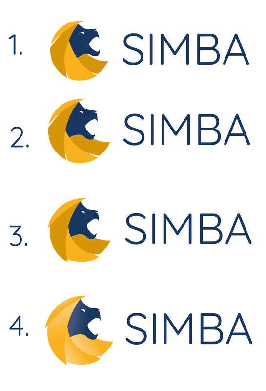
Angles & Contrast
Here you can see us working through variations of the logo concept, changing the angle of the head and mouth, and the degree of separation between the vectors of the mane.
This was used to display to the client how angling the head higher in a “roaring motion” would negatively affect the balance and create uneven white space. Instead, suggesting movement and separation of shapes through colours or gradient was advised.
Playing with Palettes
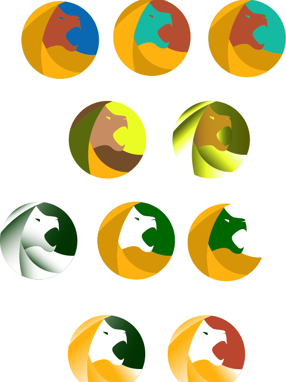
The client had a vast array of colours that they wanted included in the brand, built on various inspirations and personal affinities. Playing with different options helps to illustrate what does and doesn’t work very quickly. We steered away from the earthy/terracotta and cyan they had first envisaged, and went with a simpler, higher contrast, and more professional palette.
Early Concepts
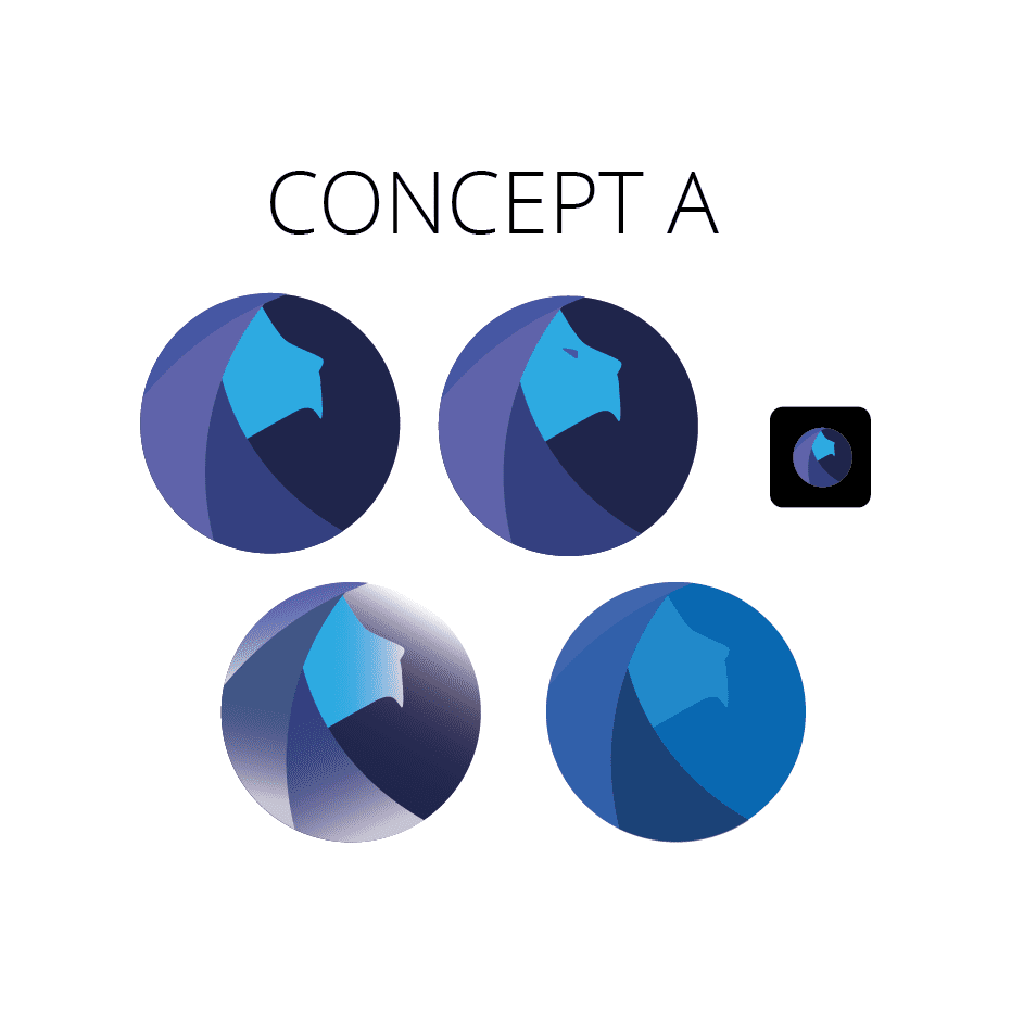
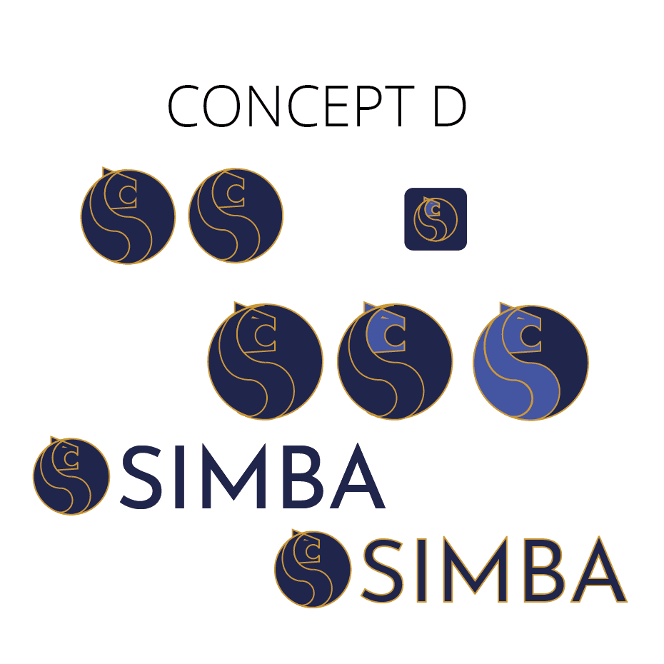
Here you can see some early design concepts for the SIMBA logo. Concept A features an older, “wiser” looking lion icon, whilst Concept D incorporates the visual flow of the letter S into the lion’s mane. Both were rejected for lack of contrast and poor visibility at a smaller scale.


